
Christina Gladback, Intern
When I started at TOPHAT in January, my first full project was designing a couple of promotional postcards. My supervisor, Adam Thomas, wanted to try out mailed promotions to see how they affected TOPHAT’s leads while testing my knowledge of Adobe Illustrator before he stepped back on future assignments. I am here to share the process we followed and what we learned with you.
Basic Steps to Design Print Promotions
- Identify purpose
- Brainstorm theme
- Sketch mockup – writing copy and identifying assets as you go
- Buy stock and font licenses
- Make custom assets
- Layout
- Send to print
- Assess outcome
Marketing on Our Minds
TOPHAT was looking for a way to stay on the minds of its clients and contacts beyond talking to each specifically, so the point of these postcards was to both keep the channels open and bring in new site traffic. Our designated appraisal for success was whether more inquiring leads contacted Charles Ogborn. With these business objectives in mind, the artistic part began.
Bits and Masterpieces
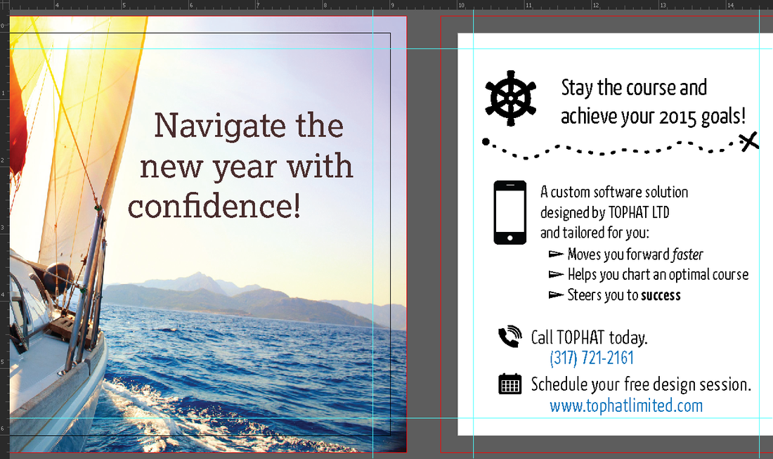
The first postcard was to be mailed in January and themed after plotting a new course in the New Year; Charles had found an appealing photo on BigStock to illustrate literal progress and our client’s ambitions for the year.

Adam and I whiteboarded a draft of the postcard, keeping the copy short and sweet but accurate. With our stock photo for the front already chosen, I didn’t need to check 123RF or BigStock for another. I found two suitable fonts from Typekit to use in Illustator, one clear and sanserif for the back, one slightly fancier and nautical-feeling for the front—in this case, Kava Pro and Lexia.
| I made all of the vector icons and personalized bullet points in separate Illustrator documents, using simple shapes, lines, the width tool, and transformation. One of the fantastic things about vector drawing and the programs that utilize it is how quickly artists with the know-how can make precise, intricate designs. Finally, I laid out all the pieces in a postcard template. This is a document of two 9 in. x 6 in. artboards with ¼ in. bleeds and guides ¼ in. in from the edge to mark the “safe” zone. Once I was editing the whole composition, my finishing touches included using one more font for its clearer numbers and sketching one divider. |  |
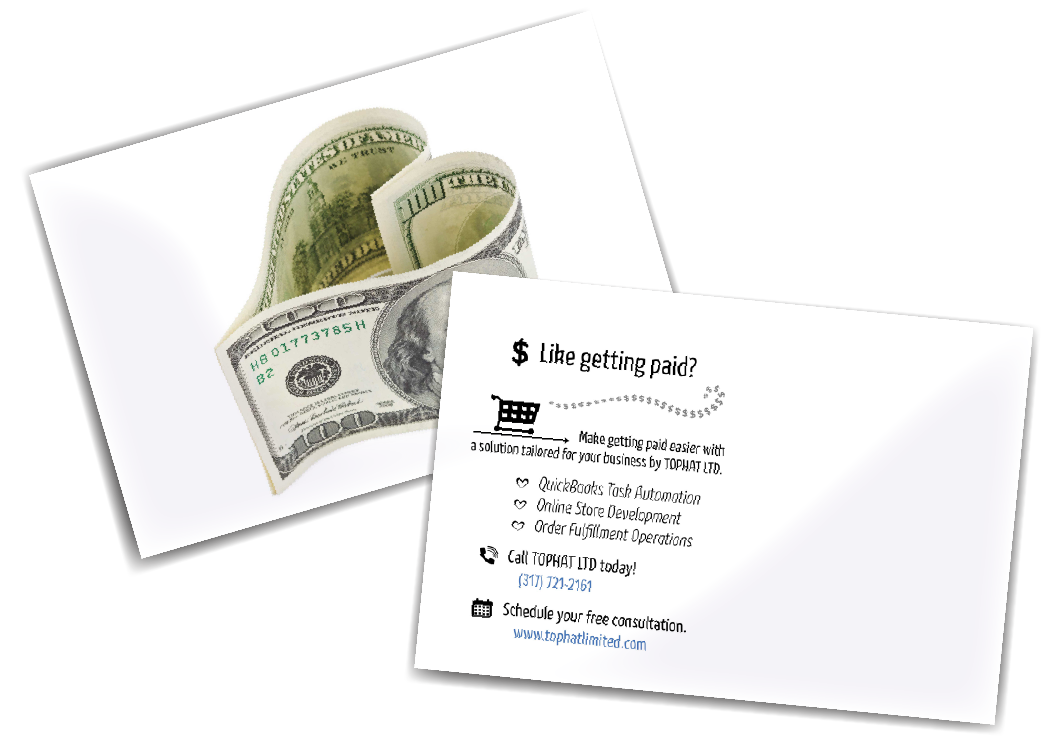
Once this was sent to the printers, we waited and watched the site metrics. In February, we sent another card with a gentle Valentine’s parody. Again, we watched the site metrics and listened for whether Charles’ contacts had gotten postcards.
Back to Business
This is where business completely overrides art. We were happy with our postcards—they were factual, attractive, and went where they were meant to. The views on tophatlimited.com spiked when each of the cards reached their destinations.
And yet, none of the recipients called Charles.
Either they did not need our services or, perhaps, our website was unconvincing. One of those possibilities we can do something about. So, now, we are focusing our efforts on improving the website before we expend the majority of our energy to point people toward it. As in all things start-up, our cycle comes back to the business.
I’m proud of the improvements we’ve made to tophatlimited.com already. The great news is, one way or another, you made it here. Take a look around; what do you think?
 RSS Feed