Cody Rassi, Intern
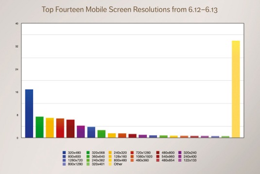
One difficult aspect of web design is compensating for screen sizes. As more screens are being made with unique sizes, between smart phones, tablets, laptops, and desktops, there are thousands of sizes screens available. If you have a web site, there’s a good chance you have accessed it on multiple devices yourself, and there’s no reason your customers will be any different. Having many different devices is a wonderful part of our era, but it can make things difficult for web designers.
Years ago, web designers were able to simply make pages that appeared depending on the few options of screen sizes available. Things are different now. In order to deliver the right page to the user depending on the screen size, a developer must use what is called Responsive Web Design. Responsive Web Design delivers the content in a form appropriate for the user’s screen. Rather than making thousands of copies of a single web page, Responsive Web Design allows the website to recognize the size of a user’s screen and shape the content to match it.
When a user opens a web page, if the web page is responsive, it will test the user’s computer to find out its screen size. Then, the responsive web page will structure its data to fit the screen. To do so, it is likely the web page will use break points. These break points allow the developers to pre-structure the format of the page if it’s within a certain size range. One way to see an example of break points is to shrink and expand your browser. If a web page is responsive you should see the format of the text and pictures on the page change depending on the size of the browser window.
Though this article has hopefully explained Responsive Web Design in a simple way, it can become quite complicated during development. When compensating for thousands of current screen sizes as well as future ones, development can become tough. Nonetheless, successful web design will allow your website to be versatile enough to present your information to every user on multiple devices.
Though this article has hopefully explained Responsive Web Design in a simple way, it can become quite complicated during development. When compensating for thousands of current screen sizes as well as future ones, development can become tough. Nonetheless, successful web design will allow your website to be versatile enough to present your information to every user on multiple devices.


 RSS Feed